Challenge
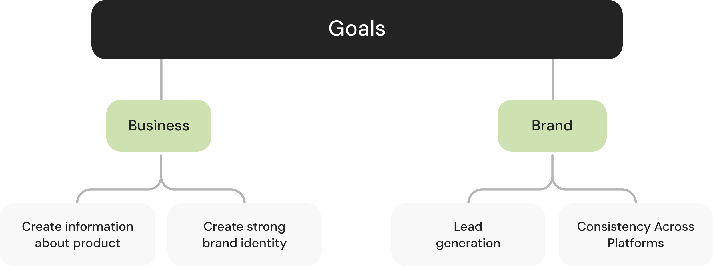
The objectives included introducing the new collection, emphasizing its features, driving conversions, and incorporating customer capture post-funnel initiatives. Additionally, the challenge extended to effectively conveying the brand's values. Adherence to marketing's guidelines and the use of essential imagery were critical components in meeting these objectives.

Design process
I have used and adapted a Design Process called the Design Thinking Method, this framework allows us to manage large projects and enables us to put the user at the center of attention.
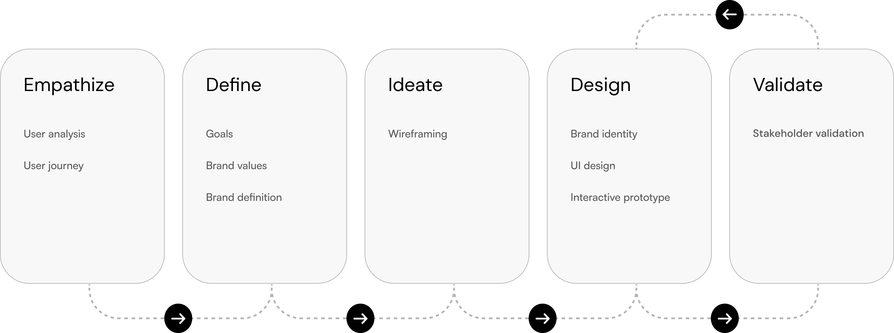
Empathize
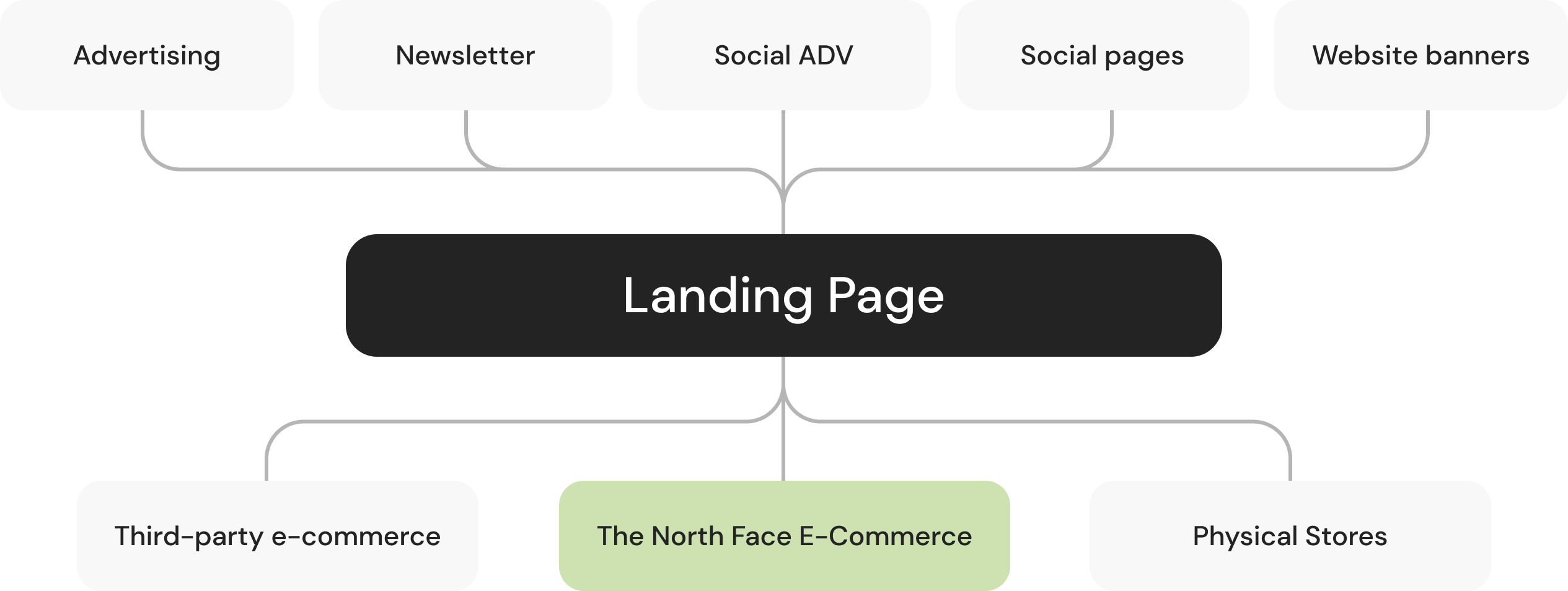
In the Empathize phase, we scrutinized past landing pages to identify strengths and weaknesses, collaborated closely with the marketing team to understand their specific needs, and analyzed user interactions. From this, we extracted a User Journey, mapping the diverse funnels users navigate from and guiding where they should be directed on the new landing page. This insightful analysis played a pivotal role in shaping targeted strategies to enhance overall user experience and optimize conversion opportunities.
Define
We need to define all the necessary aspects to meet the points extracted in the analysis phase. To do this, I have developed a framework that groups all the branding, UI, and UX principles required for the defined objectives.

Ideate
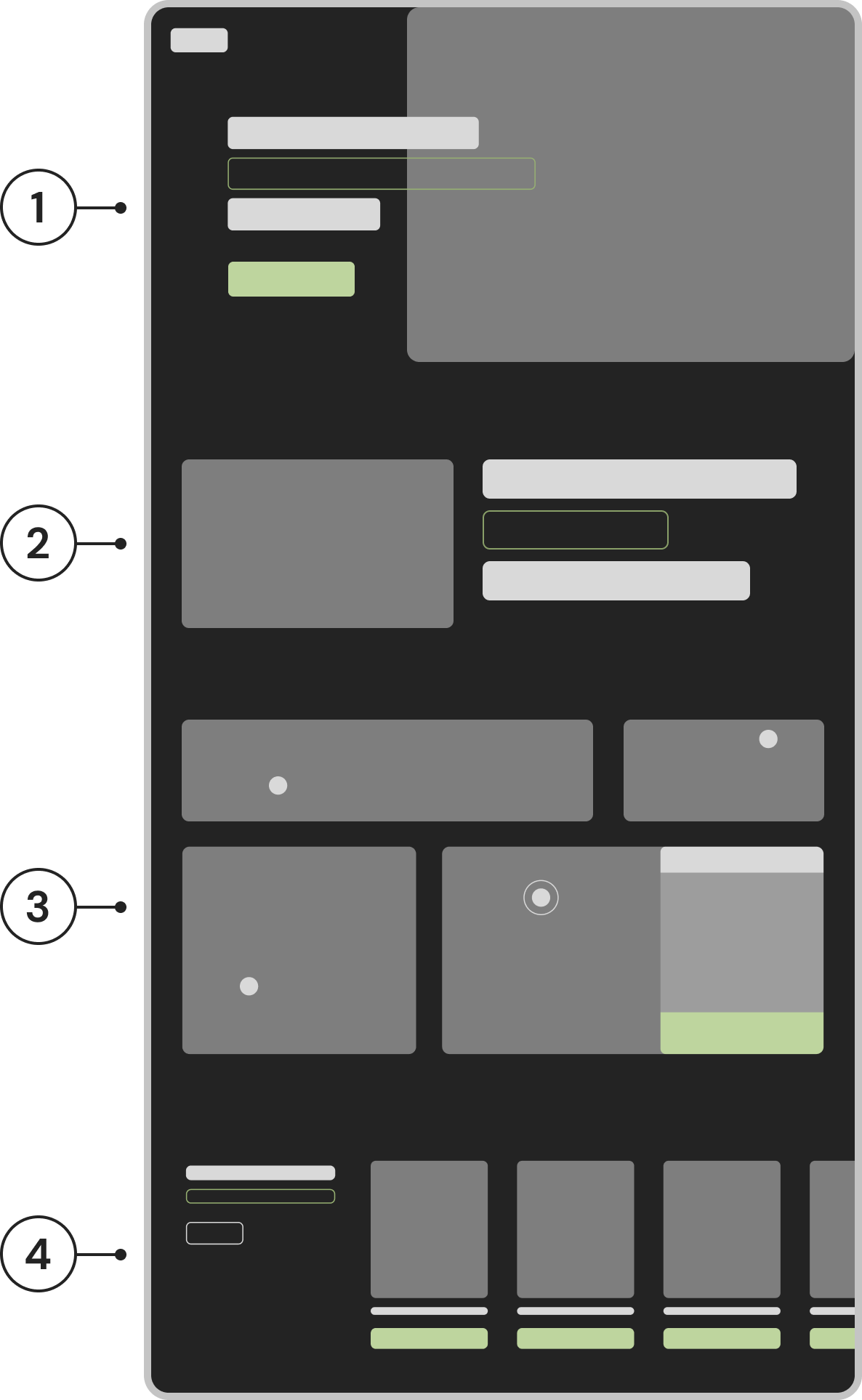
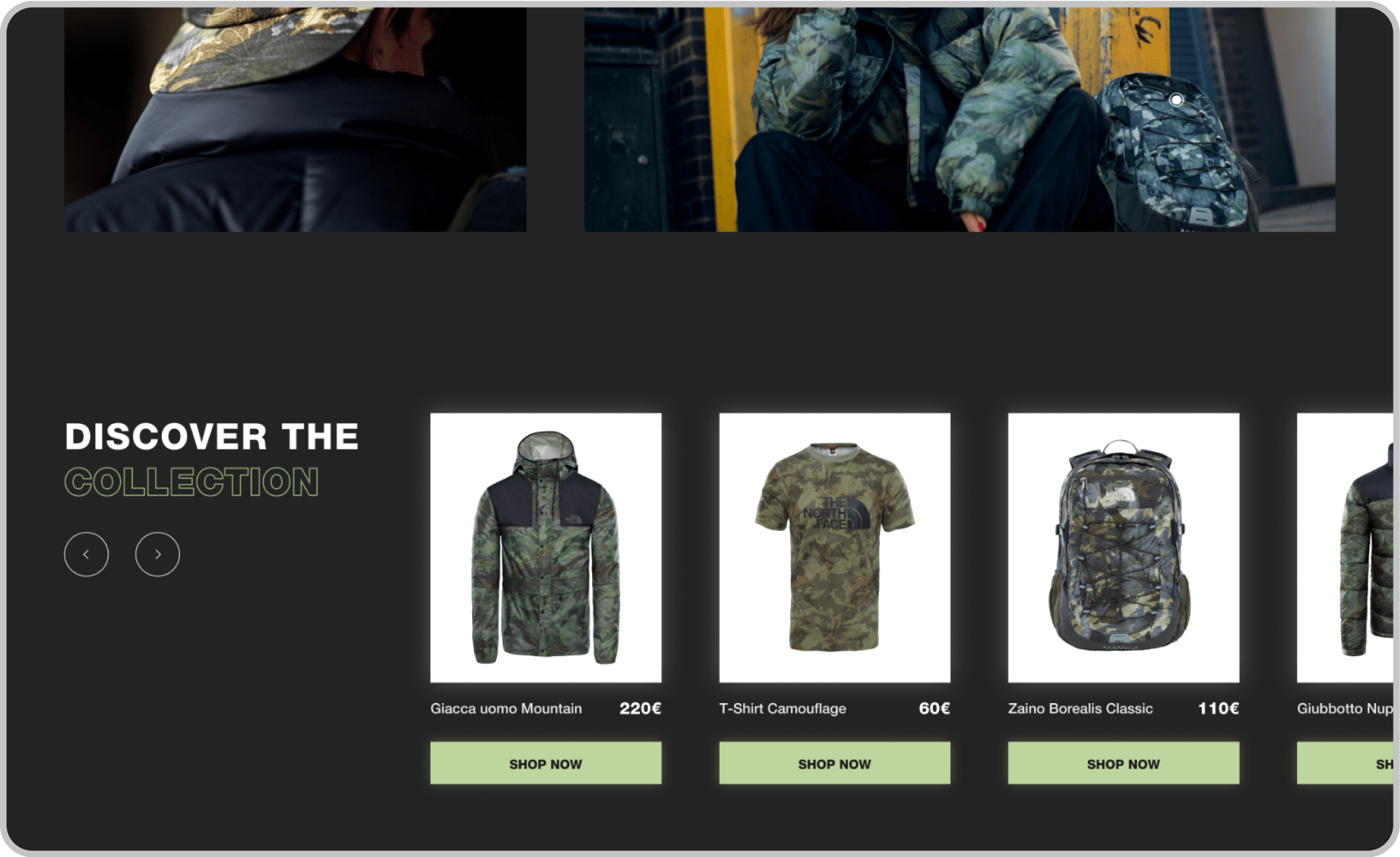
After delineating all the key points and objectives, I advanced by crafting a highly simplified wireframe for the landing page. The primary goal was the precise distribution of various product interaction blocks, aiming to develop a cohesive visual narrative.
Wireframe
After conducting a thorough analysis, extracting key
objectives, and establishing a brand definition, I proceeded
to construct a basic wireframe essential for defining the
storytelling elements of the landing page.
Below are outlined the four key elements of the landing
page, extracted from earlier stages of the design process.
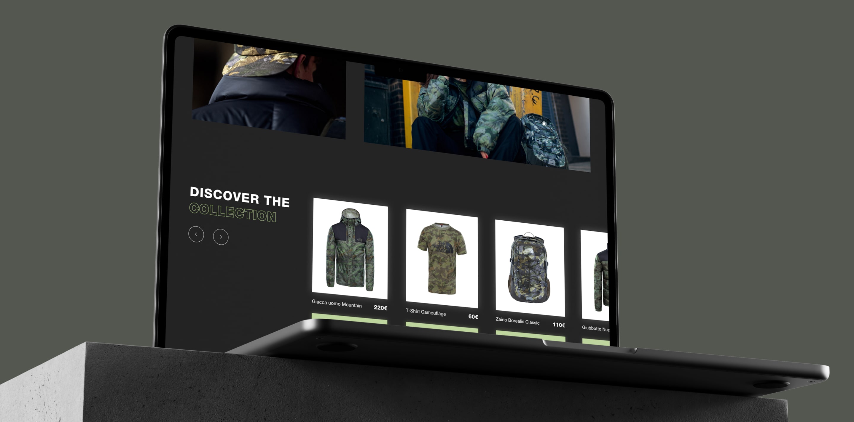
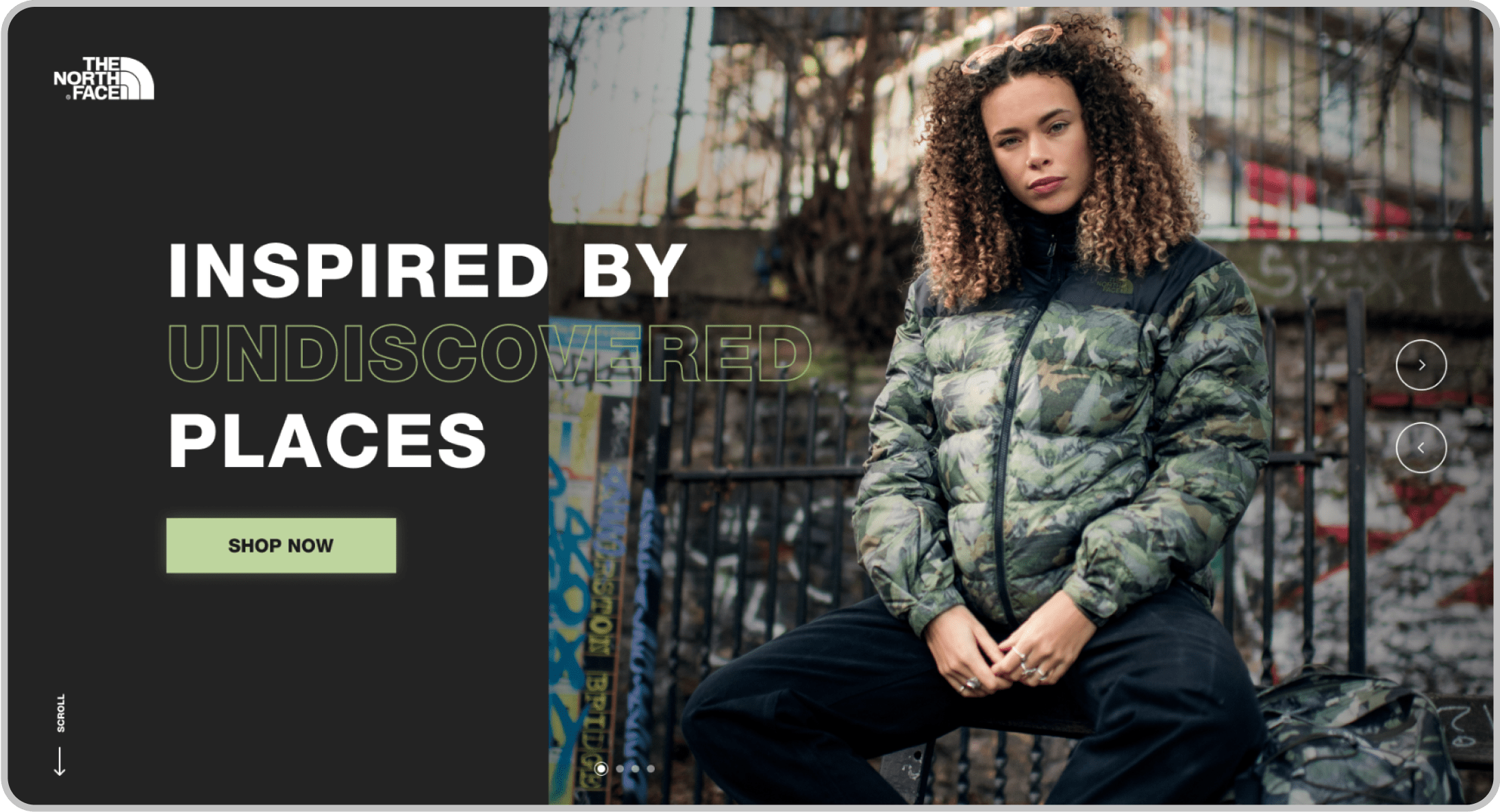
- 1. Emotional Claim + CTA
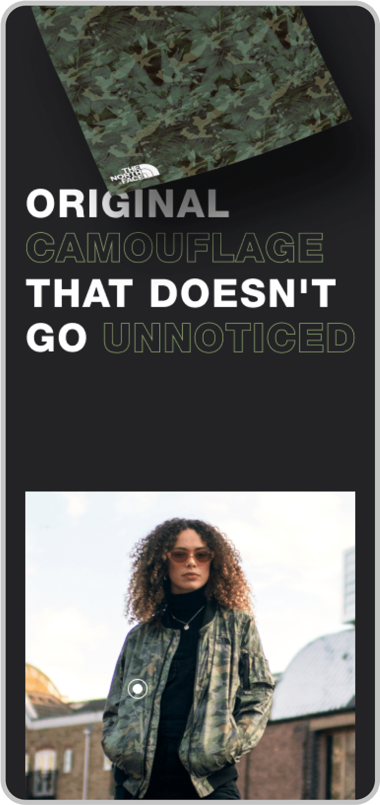
- 2. Representative text of the collection
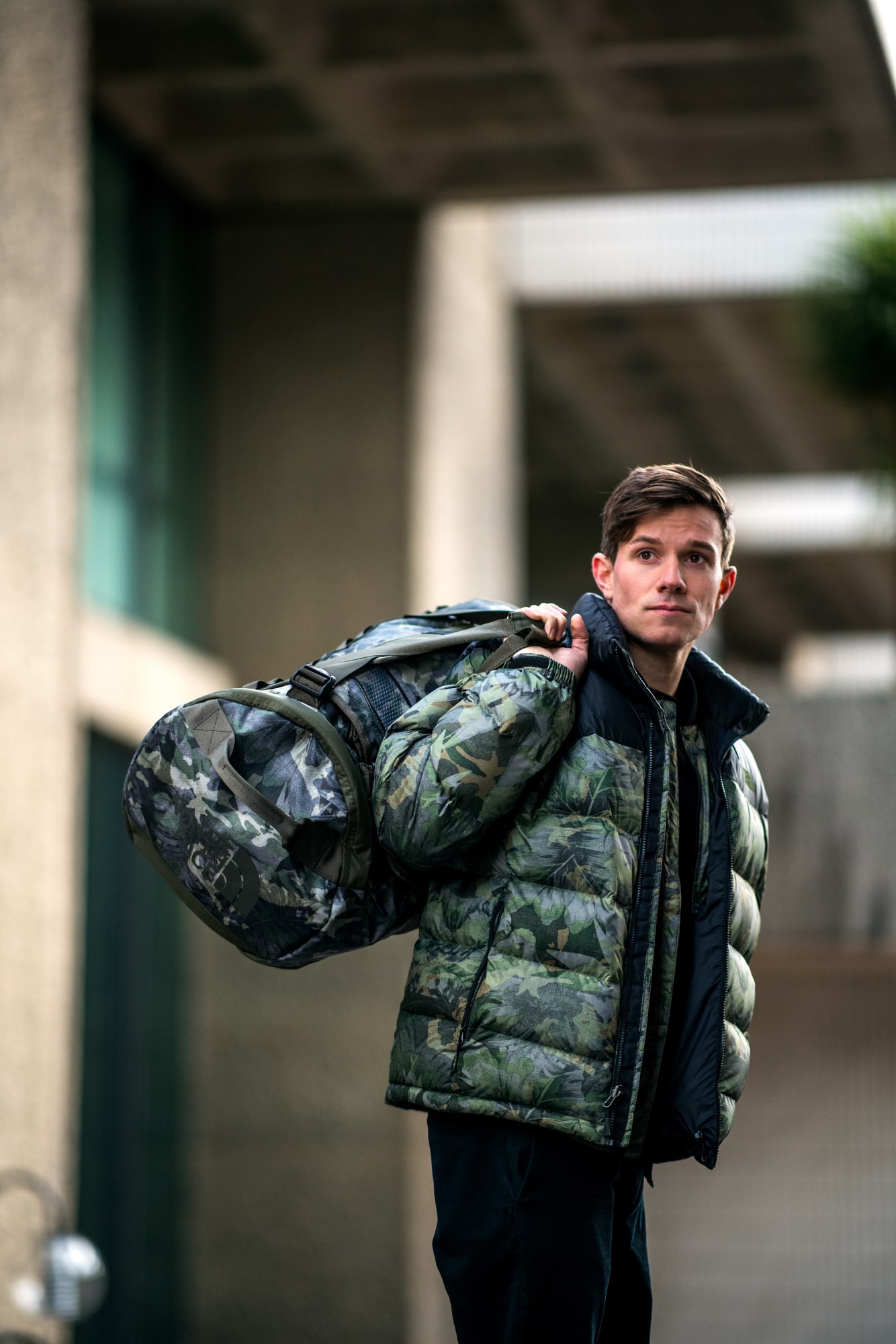
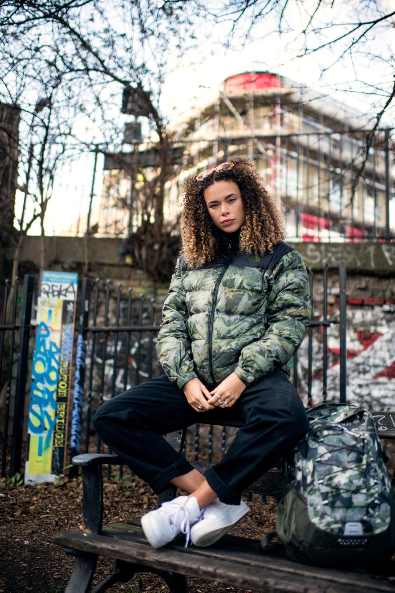
- 3. Emotional photographs + CTA on hover
- 4. Horizontal product listing + CTA
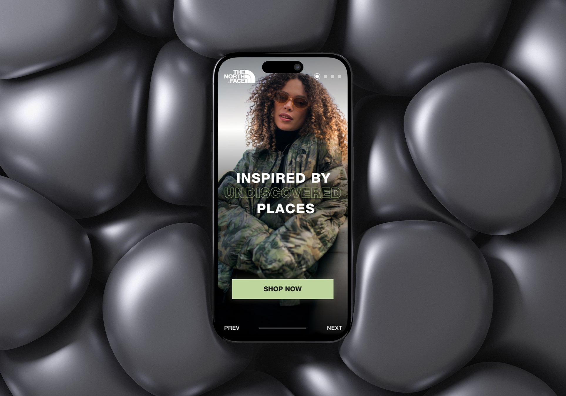
Design
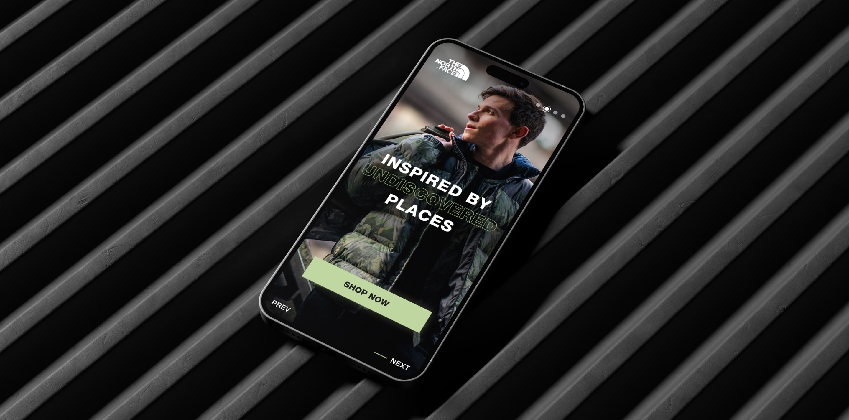
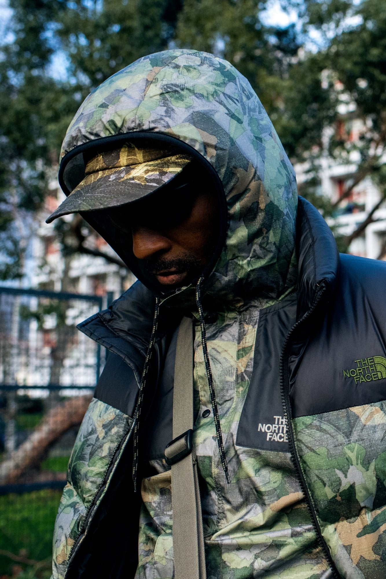
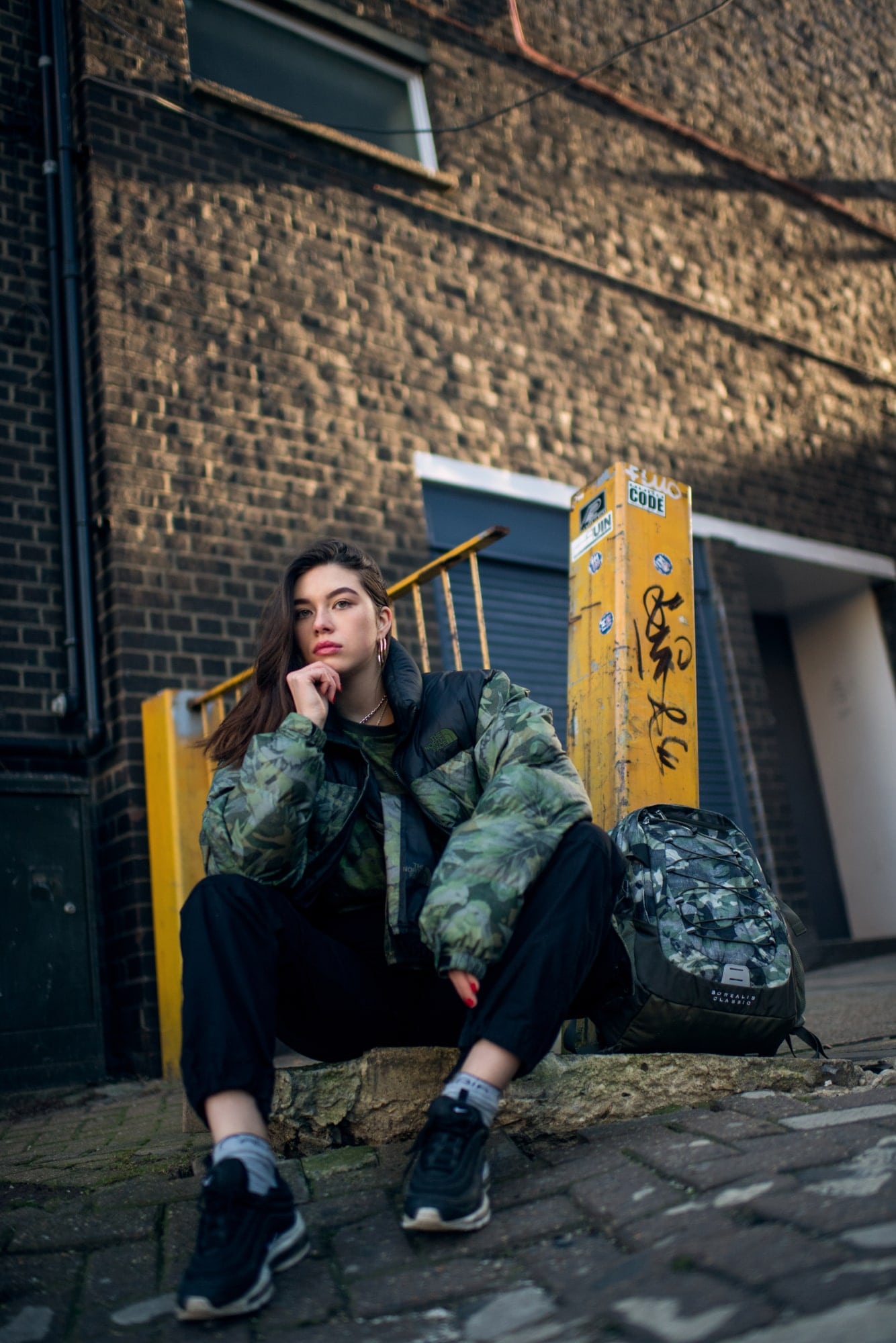
For the brand guidelines and UI approach, we opted for a simple brand design with colors echoing those of the collection and a font that aligns with The North Face's broader brand guidelines. Visual storytelling and emotional resonance are predominantly conveyed through photography, and the UI is strategically crafted to enhance these visual elements. To effectively communicate our design proposal to stakeholders, we developed a high-fidelity prototype.
Brand identity
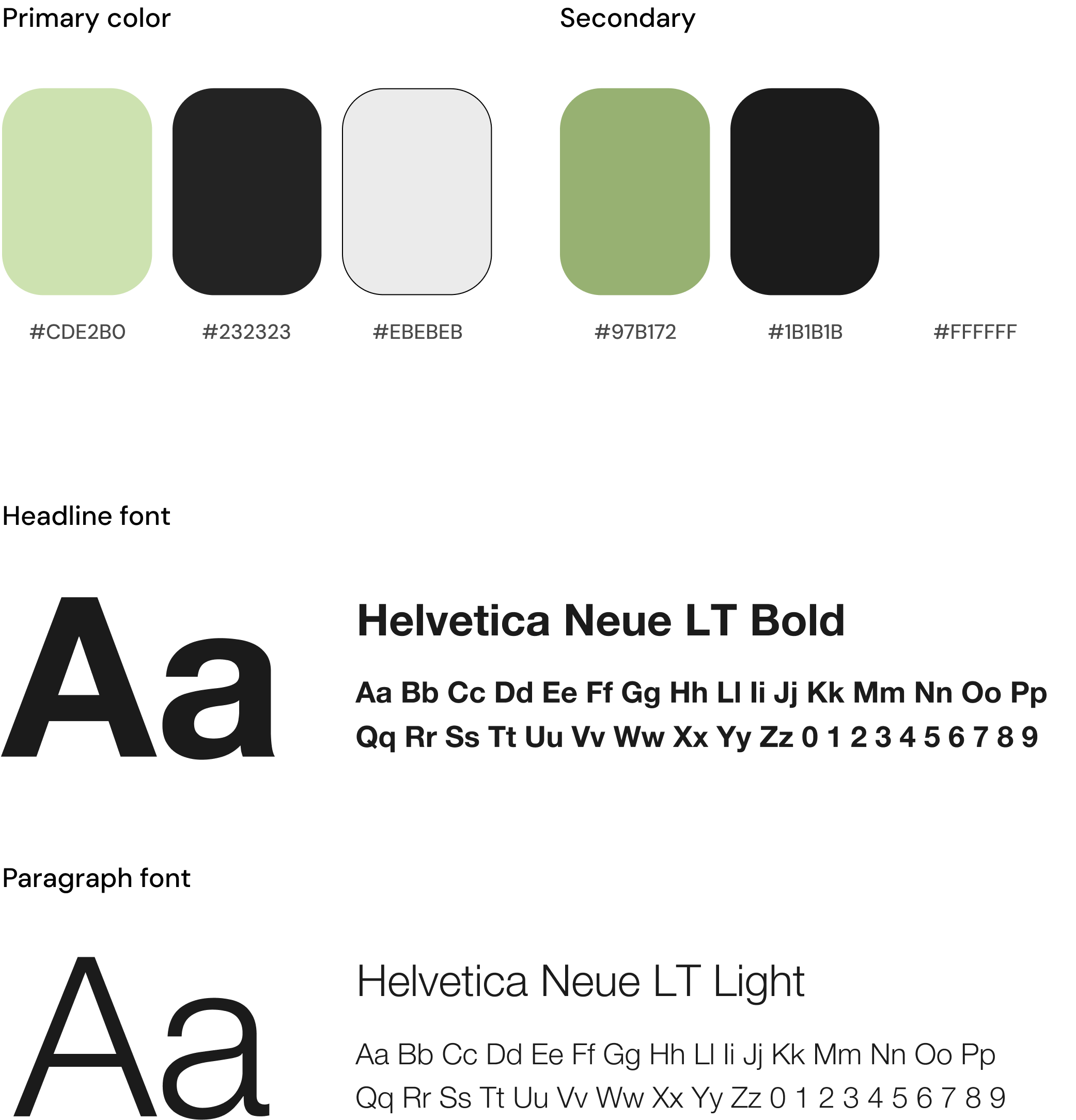
UI Design
UI Design & Brand Design for The North Face
Validate
After each step, we presented the product to stakeholders to receive continuous feedback on the project's progress, ensuring that we were moving in the right direction and making necessary adjustments as needed.